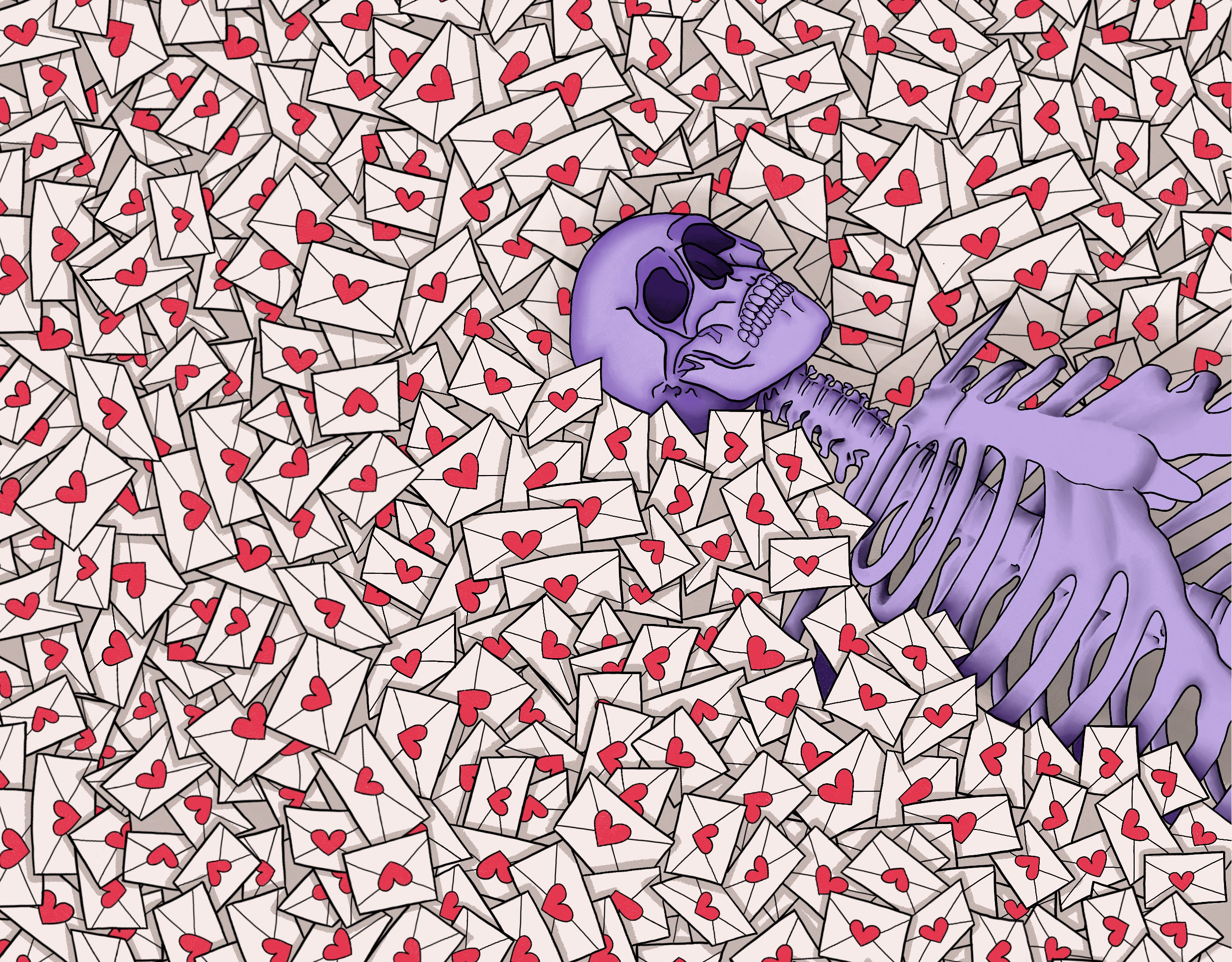
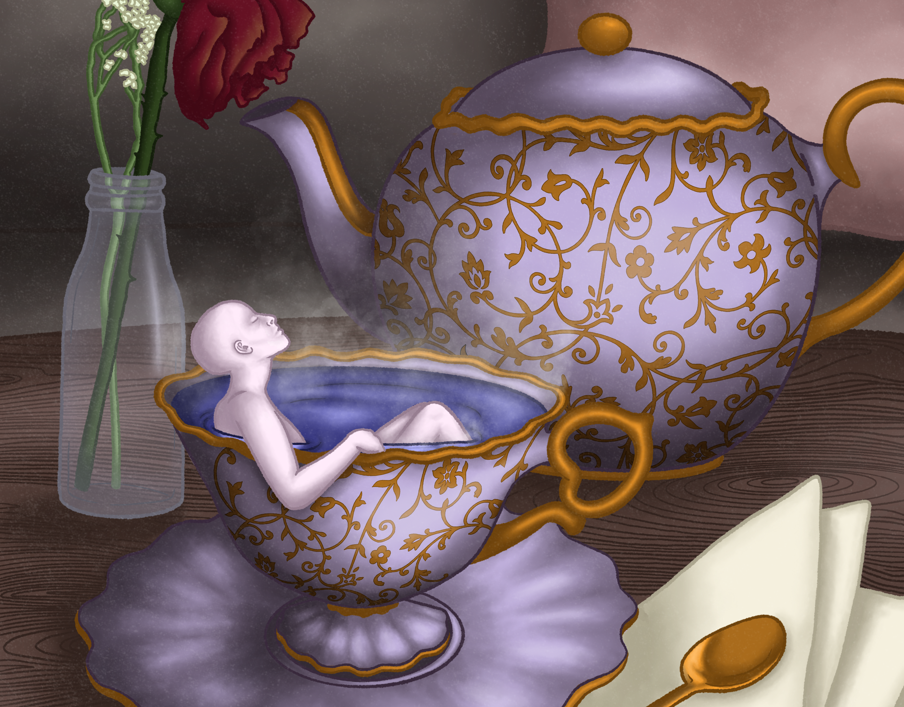
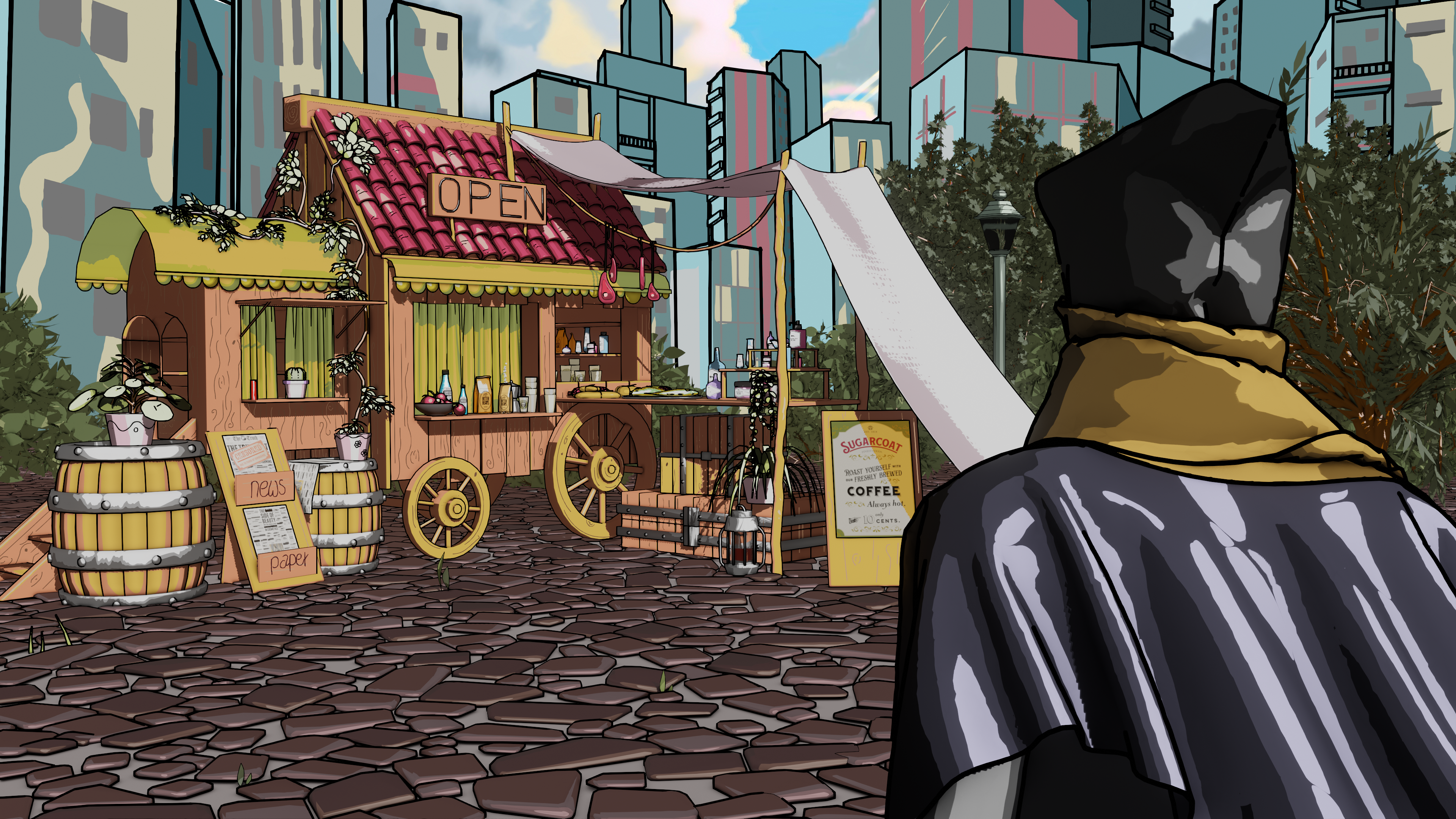
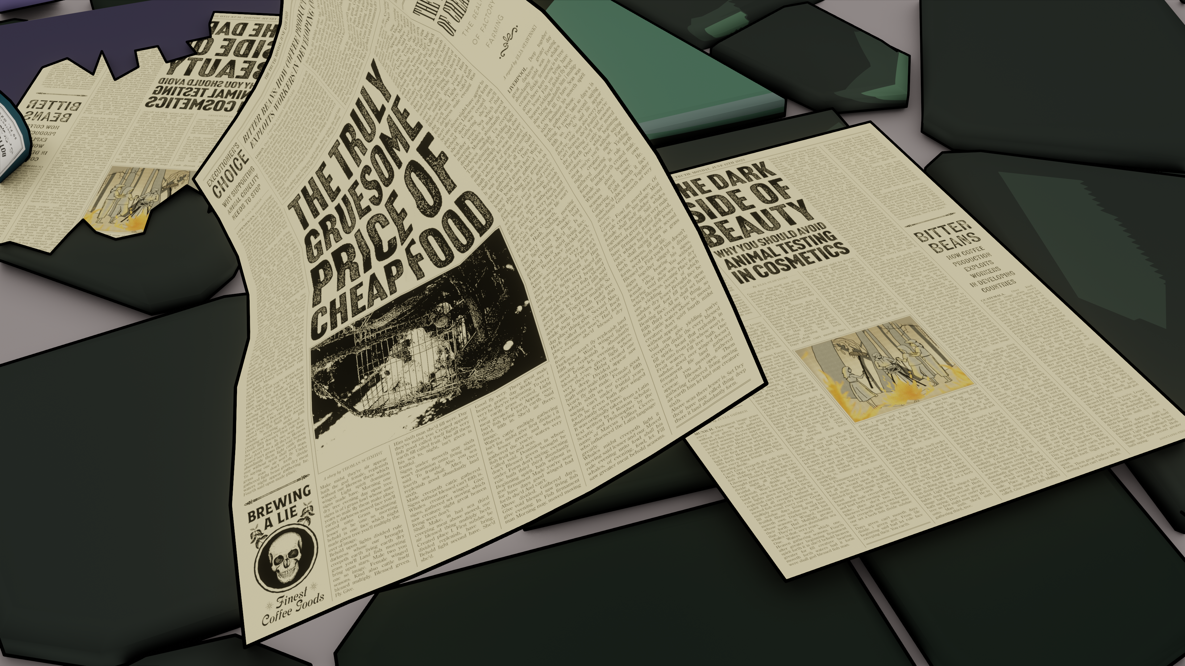
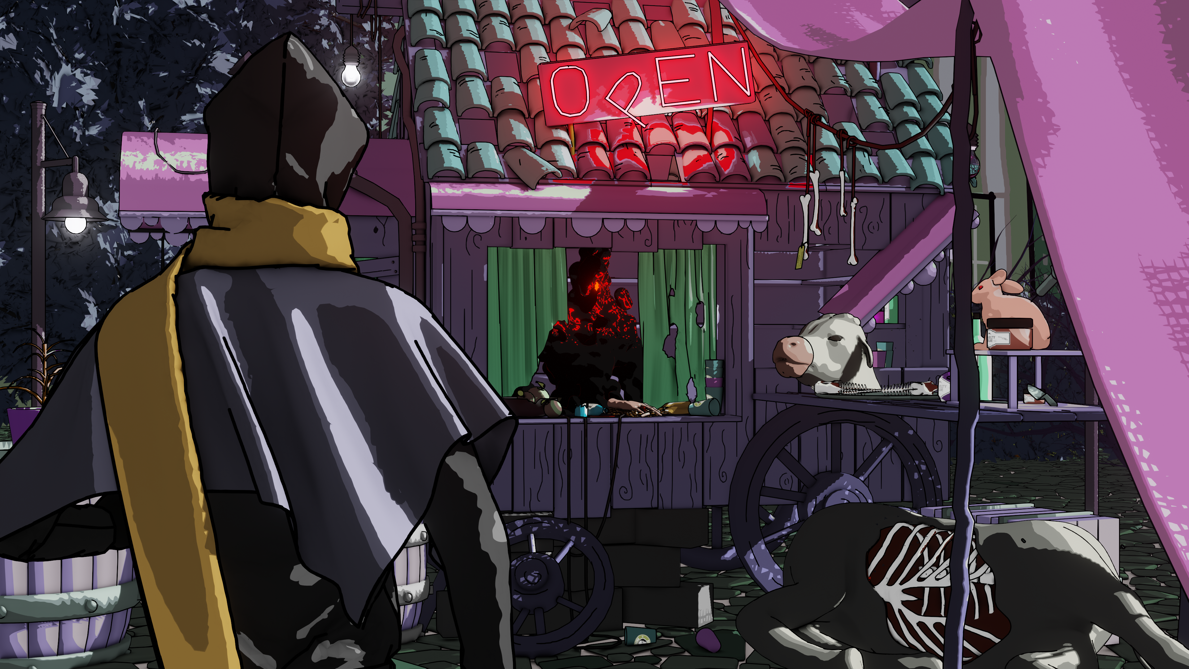
"Sugarcoat" is a short animated film that explores the concealed dark side of everyday products, masked behind clever marketing and vibrant labels. It revolves around the central theme of personal choice - whether to face the uncomfortable truth or turn a blind eye.
In the film, we follow the main character as he orders a coffee, symbolising an act of daily life. As he briefly confronts the unsettling reality behind the product, a moment of truth dawns upon him. Yet, he consciously decides to ignore it, succumbing to the allure of ignorance and convenience. The film subtly challenges the viewers to reflect on their behaviour and decisions when confronted with uncomfortable truths.
The project was created by Jana Schimak, Thomas Schmidt, Elja Stawinski, Adelheid Eisl, Julia Grömer and me. I was responsible for the previsualisation, camera and storytelling, as well as asset creation and choosing our color palette.
PREVISUALISATION
I began by storyboarding scenes to plan shots and camera angles. Using simple low poly models, I blocked out scenes in Maya to focus on composition and timing. Maya's camera tools helped in animating camera movements for each shot, visualizing static images into moving pictures. Through this process, I learned how to tell a story with the camera, capturing action and emotion through key poses for characters, and understood the concept of time and pacing in film. Regular feedback sessions guided refinements in timing and spatial relationships between shots, helping me handle critique better.
ASSET CREATION
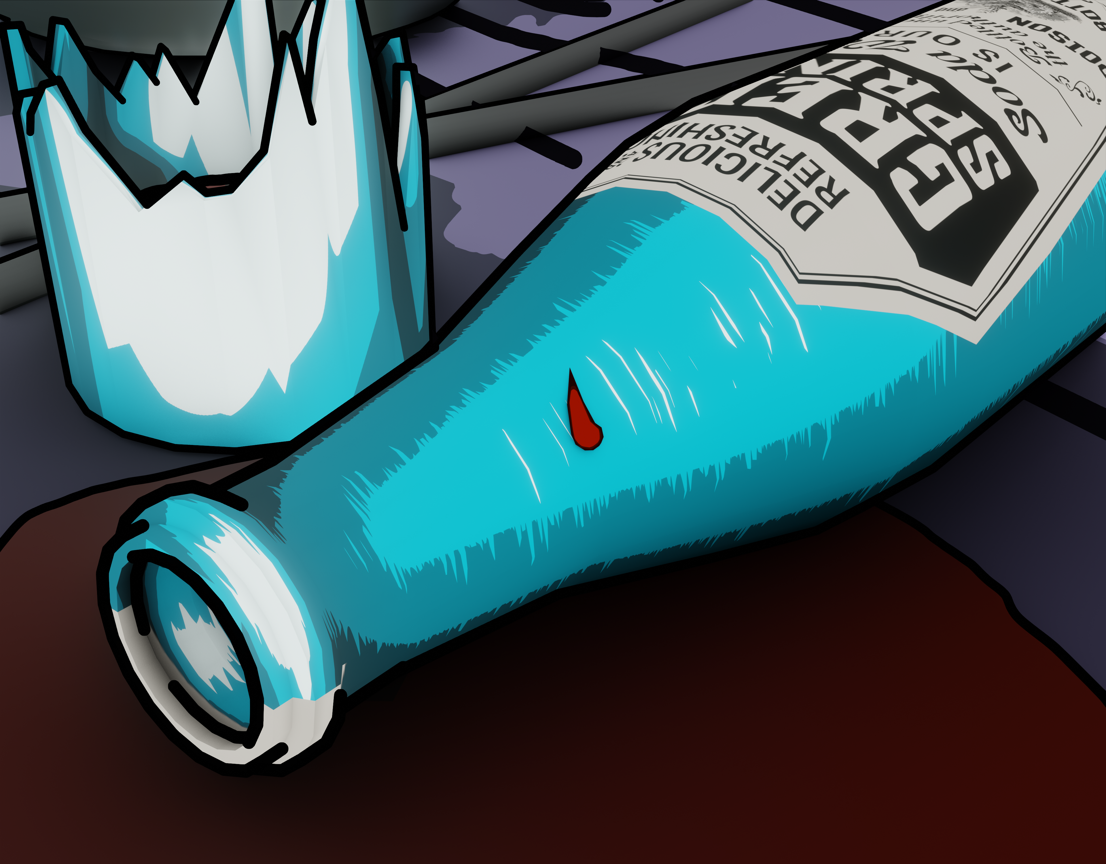
My task during production phase was to create the organic assets, while my colleague Elja was responsible for hard surface modelling. I gathered a lot of reference for them, e.g. a rabbit, a dead cow, a hand, or the dead tree, and created concepts to sculpt those assets. Then I sculpted the organic assets in ZBrush, focusing on a stylized look.
COLORS
Selecting the appropriate colors was crucial for conveying our storytelling themes effectively. The depiction of the good world needed to evoke a warm, familiar sensation, whereas the bad world required an eerie, evil feeling. To achieve this, me and my colleague Jana carefully selected colors that accentuated these contrasting emotions. Maintaining sufficient contrast within the visuals was essential to ensure clarity and impact in our narrative portrayal.