Japanese Wisdom in Graphic Design
"Kizuna" is an ongoing poster series that embodies the timeless beauty and wisdom of Japanese culture through a captivating fusion of graphic design styles, typography, and colors.
In this collection, each poster gives a visual insight into themes of impermanence, authenticity, and the interplay between inner truths and societal expectations. Through the lens of different graphic design styles, typography treatments, and carefully curated colors, several japanese concepts are being explored. These visual compositions echo through the ages, each design reflecting a unique perspective on Japanese heritage and philosophy.
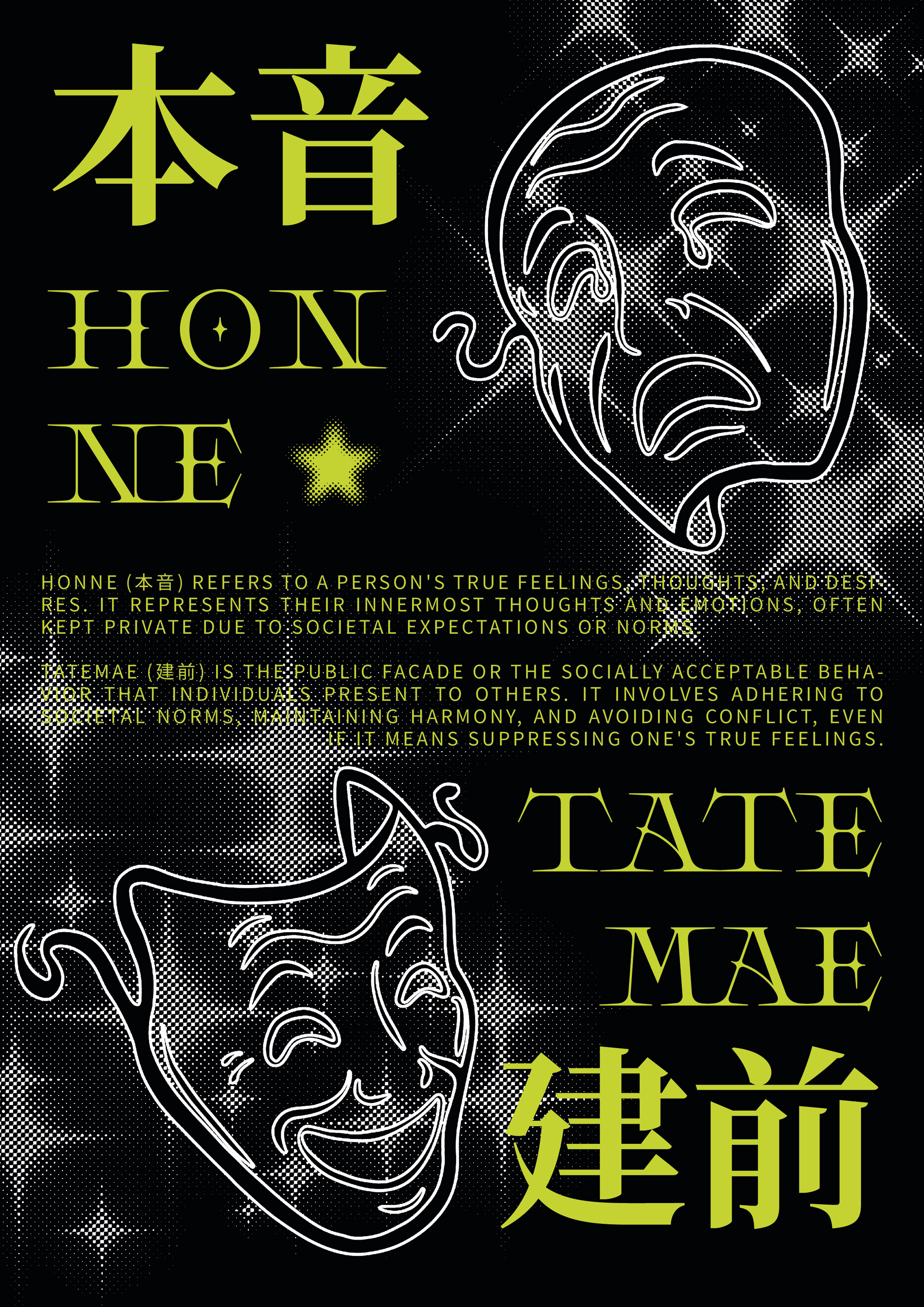
HONNE / TATEMAE
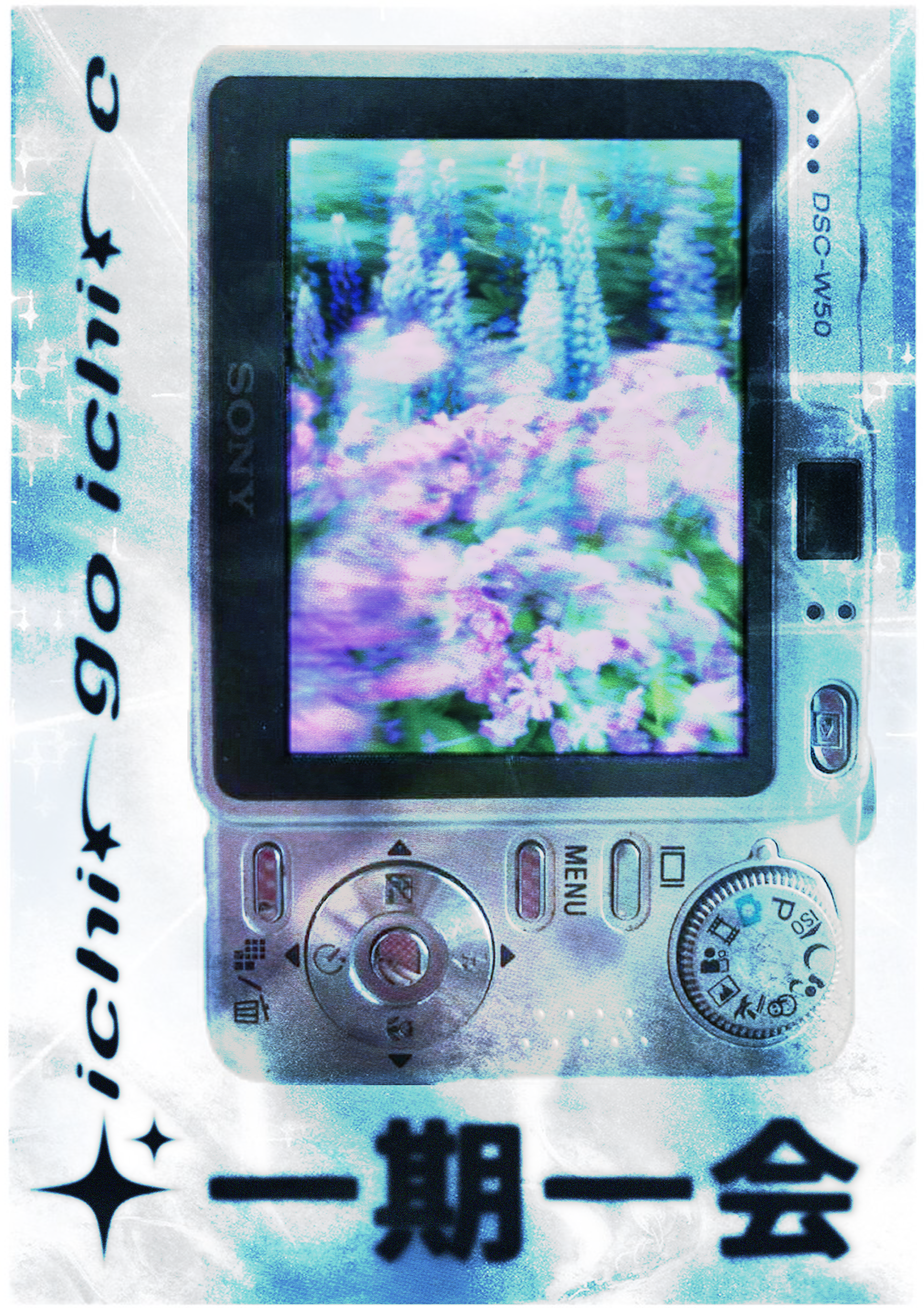
ICHI-GO ICHI-E
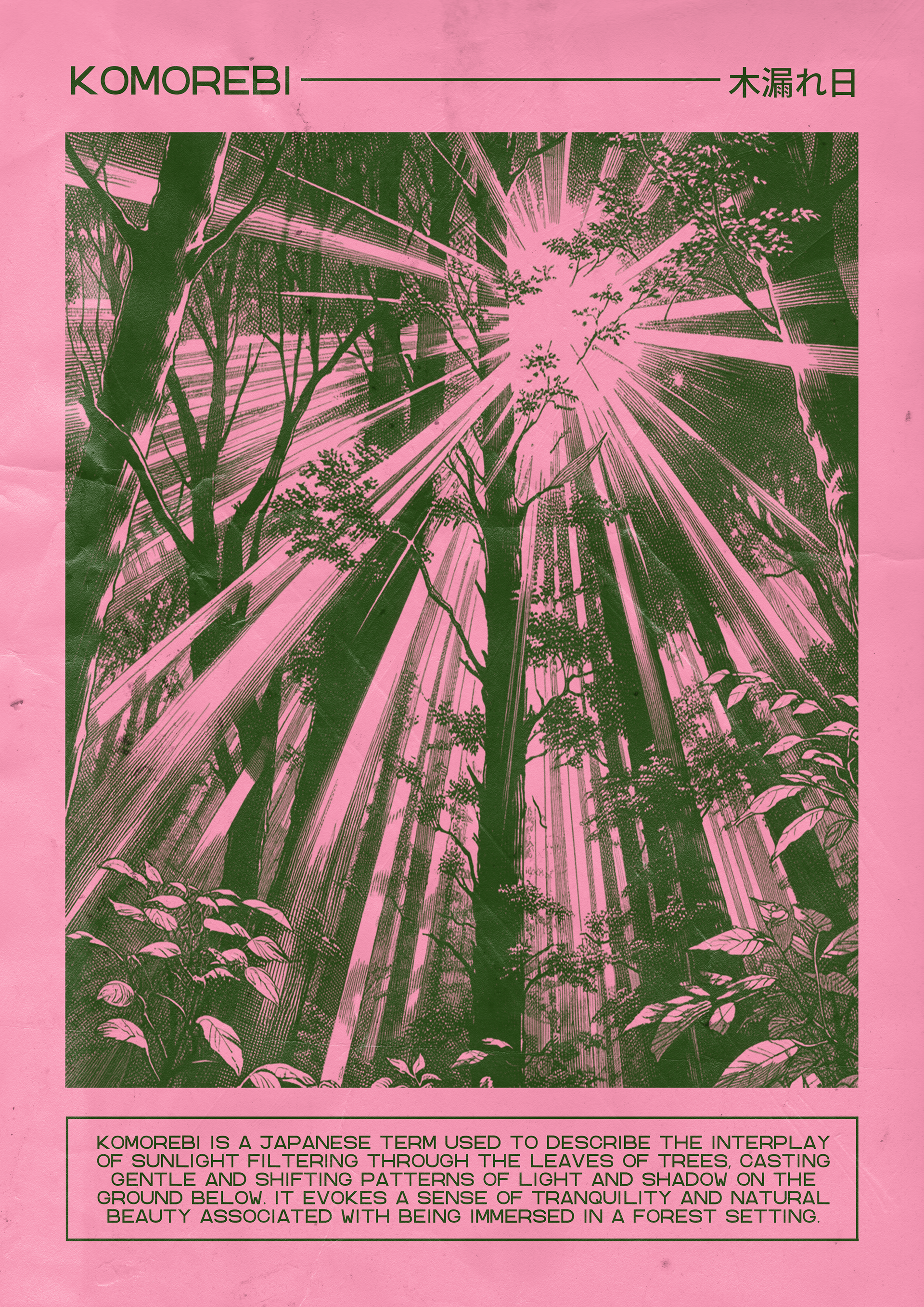
KOMOREBI
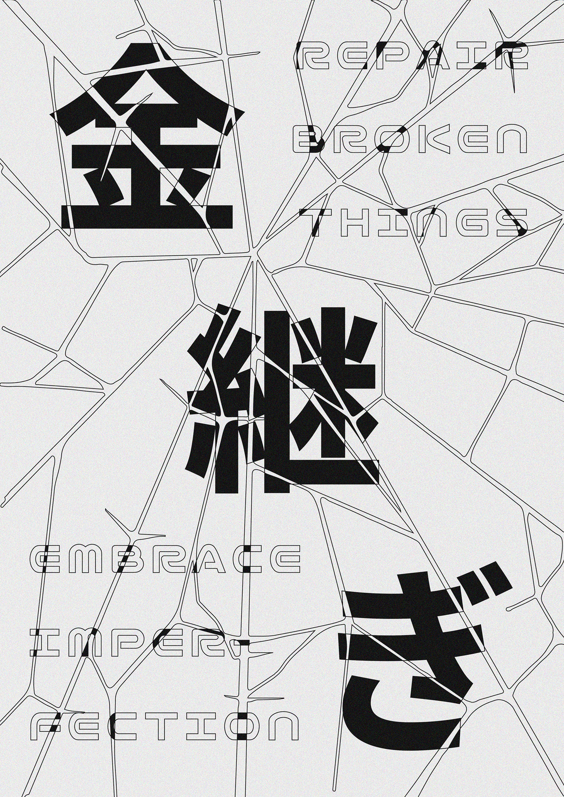
KINTSUGI
HONNE / TATEMAE (本音/建前)
Honne and tatemae are fundamental concepts in Japanese culture that describe the contrast between a person's true feelings (honne) and the public facade or social mask they present (tatemae). Honne represents one's genuine emotions, desires, and opinions, which may differ from what is expressed outwardly. Tatemae, on the other hand, refers to the socially acceptable or expected behavior and expressions that individuals display in public settings.
In my poster design, I aimed to visually capture the essence of honne and tatemae using traditional theatre masks. The theatre masks, with one side depicting a smiling, serene face (tatemae) and the other a somber or conflicted expression (honne), symbolize the duality of human nature and the contrast between inner truth and outward appearance.
ICHI-GO ICHI-E (一期一会)
Ichi-go ichi-e is a Japanese concept that translates to "one time, one meeting" or "once in a lifetime." It encapsulates the idea of treasuring each encounter as a unique and unrepeatable moment, emphasizing the impermanence and significance of interpersonal connections. This concept encourages living fully in the present and appreciating the fleeting nature of time and experiences.
In my poster design, I aimed to visualize ichi-go ichi-e through the lens of a camera capturing a specific moment. The camera symbolizes the act of seizing a singular opportunity or encounter, freezing it in time before it fades away. By framing the concept within a photographic context, I sought to evoke a sense of immediacy and mindfulness, urging viewers to cherish each passing moment as if it were a rare and precious gift. Additionally, I incorporated a Y2K-inspired style into the design to evoke a sense of nostalgia and symbolize the passage of time.
KOMOREBI (木漏れ日)
Komorebi is a beautiful Japanese word that describes the interplay of sunlight filtering through the leaves of trees. It embodies a serene and poetic moment, highlighting the enchanting dance of light and shadow in a forest setting. This concept evokes a sense of tranquility and connection to nature, emphasizing the ephemeral yet profound beauty of natural phenomena.
In my poster design, I sought to capture the essence of komorebi by utilizing an old paper-like texture as the backdrop. This texture adds a vintage and tactile quality to the composition, suggesting a timeless quality that complements the transient nature of komorebi itself. The choice of pastel pink and dark green colors creates a striking contrast, enhancing the visual appeal and drawing attention to the play of light and shadow depicted in the image.
The central image of light shining through trees in a forest serves as the focal point, embodying the concept of komorebi with its ethereal and atmospheric quality. The dappled sunlight filtering through the lush green foliage evokes a sense of wonder and calm, inviting viewers to contemplate the beauty of nature's gentle embrace.
KINTSUGI (金継ぎ)
Kintsugi is a traditional Japanese art form that involves repairing broken pottery with lacquer mixed with powdered gold, silver, or platinum. Rather than disguising the cracks, kintsugi celebrates them as part of the object's history, turning imperfections into beautiful and integral elements of the piece. This practice embodies the Japanese philosophy of wabi-sabi, appreciating the beauty of impermanence, imperfection, and the passage of time.
In my poster design, I aimed to visually represent kintsugi through typography by using a broken glass 2D graphic to disrupt and fragment the text. The typography starts out intact but appears to shatter and break as it progresses, reflecting the concept of brokenness and repair. The use of a graphical representation of shattered glass symbolizes the transformative nature of kintsugi, where flaws are embraced and enhanced with precious metals.
Software: Adobe Photoshop, Adobe Illustrator, Procreate
Sources: Unsplash, Gumroad, Pinterest, DALL·E

